
Model development workflows involve ad-hoc explorations and the results of previous experiments often inform the next set of experiments. To test, evaluate and share model iterations, data scientists need access to rich visualizations for comparing model metrics and tracking how these metrics change during training.
With Verta’s newly released interactive charts feature, you can build custom charts and dashboards to analyze, compare, and share the results of your experiment runs.
It helps you to do the following;
- Compare experiment runs, track model performance metrics across various hyper-parameter values and plot a variety of charts
- With an easy-to-use drag and drop interface in our chart builder tool, add charts for any of your logged metrics, attributes, and hyperparameters
- Create custom dashboards for your teams to collaborate on and reuse
Get started by logging experiment run details and various model performance metrics, hyperparameters, and other attributes in Verta using our client library. Learn more about how to log experiments with our quick start guide and an end-to-end example with a scikit-learn model.
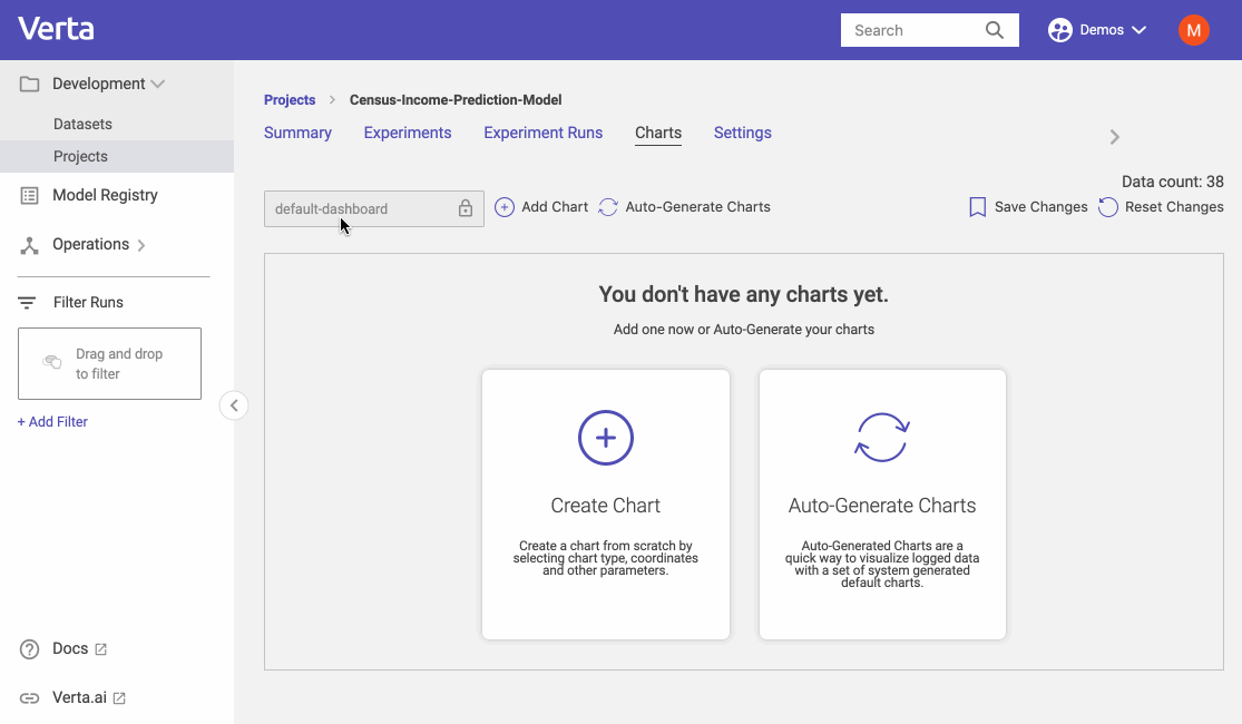
Get access to out of box charts in projects
Verta experiment tracking already stores your hyper-parameters, metrics, attributes, dataset samples, and much more in Projects. You can get access to out-of-box charts by going to the Charts tab and clicking on “Auto-Generate Charts”.
This should instantly create several visualizations for your experiment runs;
- Model metrics (accuracy, validation accuracy, etc.) over time and across runs
- Model metrics over various hyperparameter configurations
- Parallel coordinates charts to summarize the relationship between large numbers of hyperparameters and model metrics
- Loss over time and similar metrics with observation charts
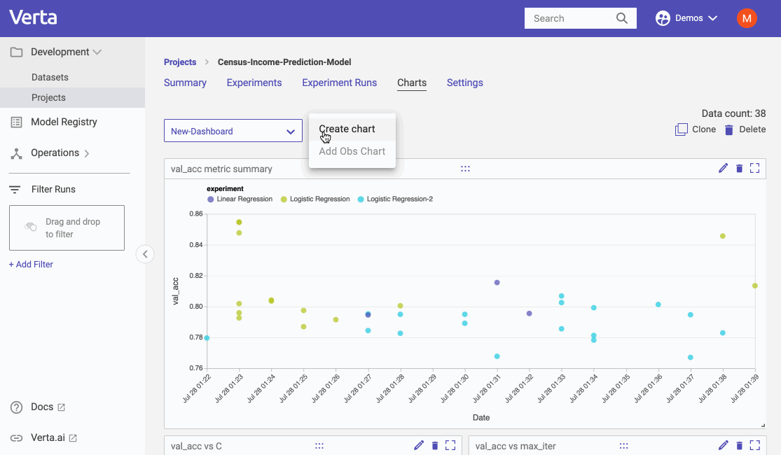
Create and edit charts with our interactive chart builder
Use the chart builder tool to create any chart of your choice using any logged metrics. You can do the following;
- Add charts for any of your logged metrics
- Click on the “Create chart” button and build a chart from scratch
- Select from a comprehensive list of chart types - line chart, bar chart, scatter plot, box plot, Parallel coordinate chart, etc.
- Add titles for the plot, select chart type, select legend from logged metric, x and y coordinates and the chart will be immediately displayed to preview
- Add the chart to your dashboard
- Compare multiple metrics on a single chart
- Edit/update an existing chart
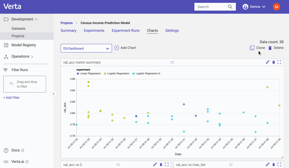
Build custom views and dashboards
With the ability to build different dashboards, you can create custom views for different team members and easily share interesting results and the status of your projects.
With our customizable dashboard capability you can;
- Create a new dashboard by cloning from existing ones
- Name your dashboard, save and share
- Add, remove charts from a dashboard
- Drag and drop charts within a dashboard
- Resize charts
To learn more, visit our docs or schedule a demo today!
Subscribe To Our Blog
Get the latest from Verta delivered directly to you email.